
Is it paints and inks? Canvases and sketchbooks? Pens and pencils?
We all know that a shop is so much more than the kind of products that they stock or even the customer service. It's the experience, from the moment you walk through the door.
We all know that a shop is so much more than the kind of products that they stock or even the customer service. It's the experience, from the moment you walk through the door.
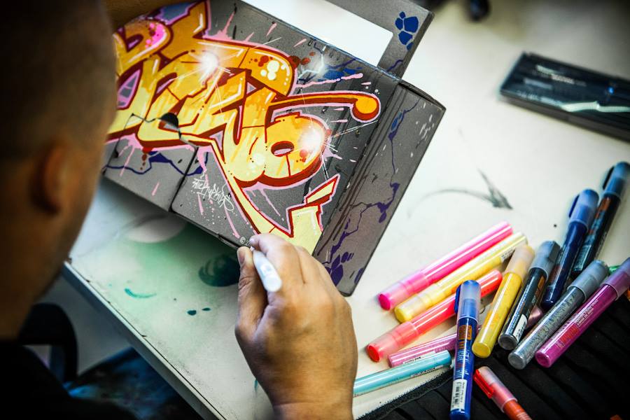
(These awesome Montana markers are available in store!)
When you think of an art store what are the first words that spring to mind? Juicy adjectives like creative, inspired, original, tactile, visionary, decorative, imaginative, thoughtful... So why is it that almost every single art store is the exact opposite of these?!
When we were working on making InkMonkey a reality this is something that we just couldn’t get our heads around. Were we missing something? Is there a standard interior design brief which says that a bricks-and-mortar art store has to be as dull as dishwater?
Turns out no such brief exists, but for some unknown reason almost all art stores seem to refrain from making their shop a showcase of creativity. Even though it's probably the most creative kind of store anyone could open; aimed at THE most creative, artistic people on the planet. Ironic or just daft?
 | The standard cookie-cutter art store has floor-to-ceiling shelves around the entire circumference of the shop, which are absolutely rammed with every kind of paper, pen, pencil, and paint. You haven’t a clue where to look first, and we don’t mean because there’s so many amazing things to see, but because the place is so overstocked you can’t decipher what anything is or where to find that thing you're looking for. Cue decision paralysis! We visited one branch of a large chain art store because we thought we’d get some good ideas and a ton of inspiration. In reality it was rather disappointing; the store we visited, like so many others, was just a huge white box filled with shelving. Yes you need shelves for your stock, but there was nothing inspirational about the place. They didn’t have any kind of window display; in fact they didn’t have any kind of displays at all! |
Neither of us are experts in visual merchandising, but we know what we like and we aim to think outside the box when it comes to our shop. Our vision was a retail space with a personality to reflect that of its clientele; creative, friendly, quirky, and eclectic, and stocking everything the discerning artist or designer would need, whether they’re a student, teacher, professional, or amateur. Somewhere the artistic community would feel at home. We wanted to banish the snobbery and create a relaxed atmosphere to dispel the intimidation. Somewhere you could walk into in your old clothes covered in paint, ink, or whatever, and not feel like you’re being judged.
We feel that we’ve managed to achieve this, but our store is far from finished; we see it as a work-in-progress, and each time you come in there’ll be something else to catch your twinkly peepers. There's still so much that we intend to incorporate into our store and our brand as a whole. Big things are afoot!
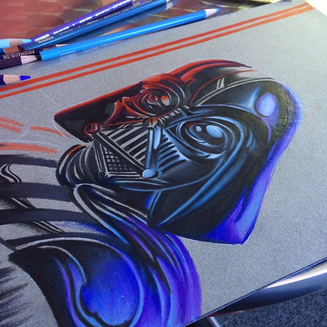
Until next time; may The Force be with you xx
We feel that we’ve managed to achieve this, but our store is far from finished; we see it as a work-in-progress, and each time you come in there’ll be something else to catch your twinkly peepers. There's still so much that we intend to incorporate into our store and our brand as a whole. Big things are afoot!
Until next time; may The Force be with you xx
 RSS Feed
